University Of Victoria

Month: October 2021

Active and Passive Learning: Game-Based Learning

Establishing the differences between active and passive learning is important understand as a teacher. To me, passive learning is the lesson. When a teacher is explaining and demonstrating material, the students are passive learning. They are lessoning to the information but might not understand. But how would a teacher know if a student does not understand? Through active learning. After the passive learning, students should be encouraged to participate in an active learning activity. This could be hands on, discussions, or any way to test their how they have comprehend the material. This is beneficial because it allows the students to practice what they recently learned. The teacher can get an understanding of who understands and who may need extra help to reach the learning outcome.

I learn best from visually seeing an explanation. This video shows how beneficial active learning can be when studying. I wish I had this information when I first started university. When I first start studying, I was passive studying. I would read the text book and lecture notes to find key words to memorize. Unfortunately, I did not know how to apply the concepts. This is because I did not actively learn or study. Now, I am able to passive learn, then extend my learning to active by reflecting and testing my self.

References

MooMoo Math and Science. 2017. Difference active and passive studying. Youtube.

Models for Media Selection & Working With Video

Video’s can be a very beneficial multimedia tool if created properly. After COVID-19 shut down the school, school moved to an online system. Here, professors did a range of multimedia tools to delivery their course material. Many of my Professors used videos to explain the class lectures. I will use the SECTIONS model to evaluate my previous class’s video lectures. To begin, my professors target was the students enrolled in the class. However, many students were forced to move back home which could mean a different time zone. With these videos, students can watch the lectures on their own time. Next, the new platform of Brightspaces made watching these videos easy to use. There were often categorized to make it easy to find a certain video. I am uncertain about the Costs and teaching function details of these videos. But, the interaction was often clear. The learning material was directed to the learners. If a learner was unclear about the material, the student can reach to the expert (professor) for clarity. Moreover, the university provided useful platforms for recording videos and posting them. This helped avoid organizational issues. Next in the model is networking. Professors would often provide other readings and videos that relate to the course material. However, this information is not always in the videos. The final step to SECTION is security and privacy. I always felt safe when watching the videos, as it was on a safe platform. Overall, it seems like my professors followed the steps in creating successful videos.

Strategies for Using Multimedia Technology Within Teaching and Learning

Sketchnotes is a great delivery method when working with learner with ADHD. Sketchnotes are visual creative hand drawings about a certain topic (Rohde, 2013).  Along with hand drawings, there are often written words and audio to explain the material. This is beneficial because the viewer can read, visualize and hear what is being explained. Sketchnote videos are often fast-paced but engaging to watch. This can help the learners who struggle to pay attention. The video shows many different drawings to explain the concept in a short video. In my opinion, this method helps me understand the concept the most.

For example, this method is a great way to understand COVID-19. In this video, they use pictures and hand writing while providing an explanation.

Since this is one of my favourite ways to learn, I want to learn how to create these videos for my future students. However, I am not very artist or creative. After watching “Sketchnoting for College Students,” I still believe I would not be able to make a decent Sketchnote. I made one but, I would not feel comfortable sharing for a learner. My goal is to practice creating these Sketchnotes so I can use this in my career.  I will practice by using different colours, sizes, and drawings. Hopefully after practice, I will be able to produce my own Sketchnote.

Multimedia Design for Learning

I could not agree more with using both words and pictures to explain new things. The human mind works in different ways and multimedia delivers to allow for all types of learners to understand (Mayer, 2005). The example of the bicycle pump reminded me when I recently had to set up a desk. The desk instructions had only pictures to explain how to set up the desk. The screws were labeled by numbers but that was it. The first step in the instructions already looked half set up. I was confused on how to get the desk to look like step one. After a while, I was able to figure it out by using the one image. I think my experience would have been better if there were written instructions as well as images. Separately, the written and image instructions would be able to get the final step. The written instructions would be hard for me to follow but with pictures to guide me, it would make the process easier. Some people may only use the picture, some may use only the written, and some may use both. The goal is to set up the desk. The instructions are there to help you get there. Thus, multi-delivery methods are useful in all learning areas.

Creating Multimedia Learning Artifacts

Visual multimedia methods can be helpful and engaging to the viewer. By using pictures and colours, more people would be curious to see what the sign, or poster has to say.  Moreover, posters, infographics, and brochures tend to be easy to read, understand, and follow along. They should be simple with only highlights of information. A crowed poster would loose the attention of the reader if there is too much text, small text, and bland colours.

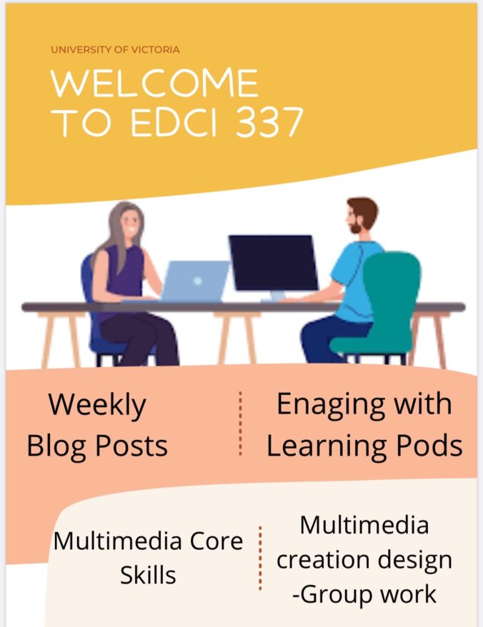
I made a poster via Canvas to indicate EDCI 337 course outline. This could be used to advertise the course to other students. This could also be used for summarizing the course outline if students struggle to understand the website.

The poster has “University of Victoria” at the top so students know what school/location this class is being taken place at. The it have the course title in a larger font to stand out the viewers. Then there is a picture of students on their laptop to show this is an online class. At the bottom, there is four sections which make up of the marks for the course. Viewers can see this poster and get an understanding of what to expect in the course.

Posters and Infographics tend to be easy to read and follow along. Thus, It is important to incorporate these methods into my future teaching lessons. For example, if the classroom is learning about outer space, the teacher can design a poster with labels, colours, and pictures. Then the class would have an understanding of what they are about to learn. The students can relate new information back to the original poster. Overall, visual delivery methods can help more students understand the information.

© 2024 Rianne Yuen

Theme by Anders NorenUp ↑