Visual multimedia methods can be helpful and engaging to the viewer. By using pictures and colours, more people would be curious to see what the sign, or poster has to say. Moreover, posters, infographics, and brochures tend to be easy to read, understand, and follow along. They should be simple with only highlights of information. A crowed poster would loose the attention of the reader if there is too much text, small text, and bland colours.
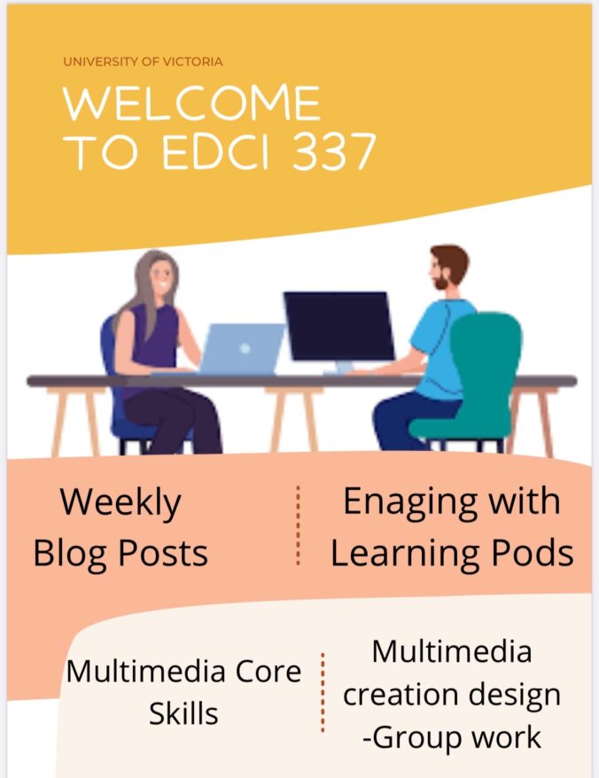
I made a poster via Canvas to indicate EDCI 337 course outline. This could be used to advertise the course to other students. This could also be used for summarizing the course outline if students struggle to understand the website.
The poster has “University of Victoria” at the top so students know what school/location this class is being taken place at. The it have the course title in a larger font to stand out the viewers. Then there is a picture of students on their laptop to show this is an online class. At the bottom, there is four sections which make up of the marks for the course. Viewers can see this poster and get an understanding of what to expect in the course.
Posters and Infographics tend to be easy to read and follow along. Thus, It is important to incorporate these methods into my future teaching lessons. For example, if the classroom is learning about outer space, the teacher can design a poster with labels, colours, and pictures. Then the class would have an understanding of what they are about to learn. The students can relate new information back to the original poster. Overall, visual delivery methods can help more students understand the information.